Mastering the Art of Gradient Colors: A Comprehensive Guide for Stunning Web Design
Learn How to Create Eye-catching Gradient Effects and Boost Your Website's Visual Appeal and SEO Performance


Gradient has three primary colours: Linear Gradient, Radial Gradient and Conic gradient.
Linear gradient: it can be set from left to right and up to bottom and diagonally.
Example: #grad {
background-image: linear-gradient(to right, red , yellow);
}
here you can see it started from left by default and goes to the right so if we want to set a specific direction from where it should start then the direction should be set at first then colors separated by the commas. you can add as much as color you need. you also can use RGBA colors(),
example of RGBA color:
#grad {
background-image: linear-gradient(to right, rgba(255,0,0,0), rgba(255,0,0,1));
}
rgba = red, green, blue, alpha( for opacity) here the max number of any colour is 0 - 255, now alpha which is opacity is started from 0.0 to 1 where 0 is the lowest point and you can't see the object if it is 0 means literally it becomes invisible at this point and 1 is the highest point.
A RGBA color is made up of four components: Red, Green, Blue, and Alpha (opacity). The alpha value determines the transparency of the color. If the alpha value is high, then the color will be more opaque and less transparent. On the other hand, if the alpha value is low, then the color will be more transparent and less opaque.
So, in comparison, when one of the RGBA color components has a very high value, the alpha value needs to be high to maintain the opacity of the color, while the alpha value of the other components can be relatively lower in comparison.
we can repeat linear gradient too:
#grad {
background-image: repeating-linear-gradient(red, yellow 10%, green 20%);
}
Radial Gradient:
Radial gradient is defined by its centre. also, we have tp set two colours one is starting and another is ending.
#grad {
background-image: radial-gradient(red 5%, yellow 15%, green 60%);
}
Setting direction:
#grad {
background-image: radial-gradient(circle, red, yellow, green);
}
repeating color:
#grad {
background-image: repeating-radial-gradient(red, yellow 10%, green 15%);
}
This will repeat the color
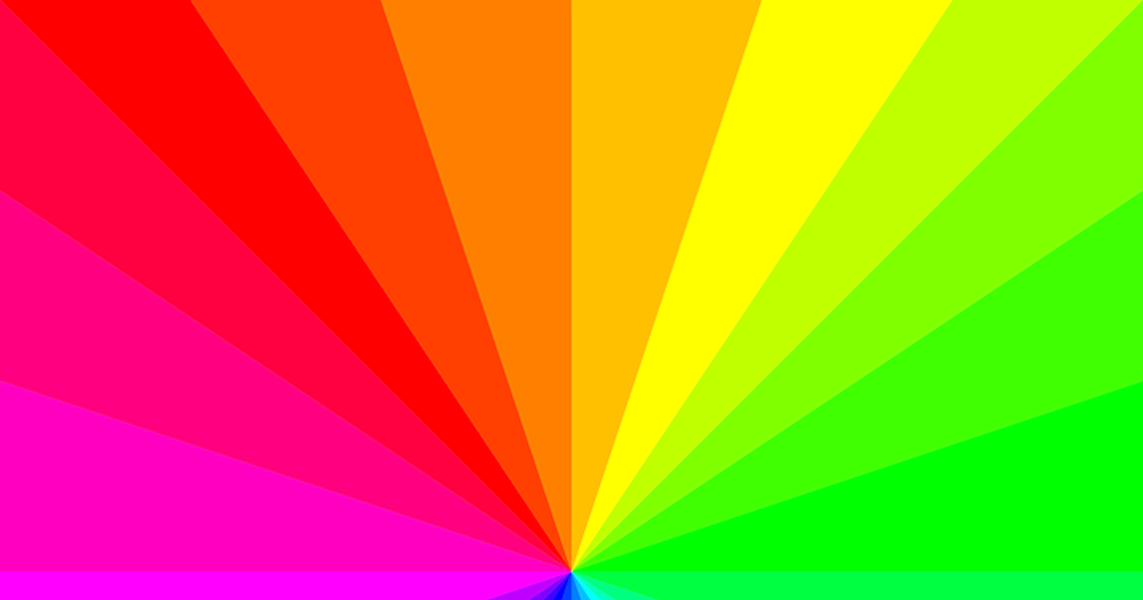
CSS Conic Gradients:
A conic gradient is a gradient with color transitions rotated around a center point.
Example:
#grad {
background-image: conic-gradient(red, yellow, green);
}
#grad {
background-image: conic-gradient(red 45deg, yellow 90deg, green 210deg);
}
#grad {
background-image: conic-gradient(red, yellow, green, blue, black);
border-radius: 50%;
}
#grad {
background-image: conic-gradient(red 0deg, red 90deg, yellow 90deg, yellow 180deg, green 180deg, green 270deg, blue 270deg);
border-radius: 50%;
}
#grad {
background-image: conic-gradient(from 90deg, red, yellow, green);
}